About Holographic Board
If metalized board is the silver screen of specialty printing, holographic board is the full light show. The approach is similar: you're working with a pre-coated substrate and deciding where to block its reflective surface. But where silver foilboard offers a consistent metallic sheen, holographic board shifts through a rainbow spectrum as viewing angles change. It's the kind of effect that stops people mid-step at trade shows and makes retail packaging impossible to ignore on crowded shelves.
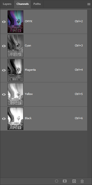
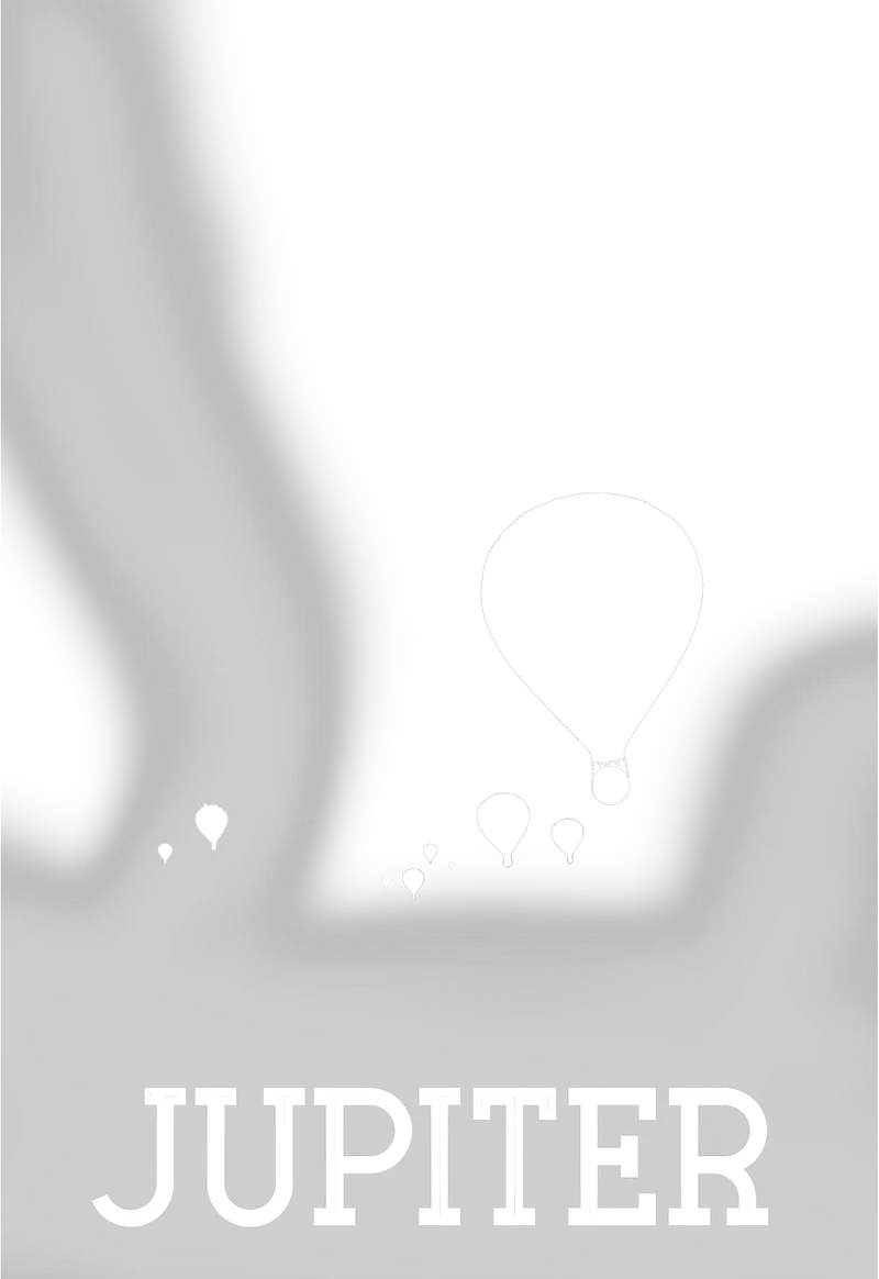
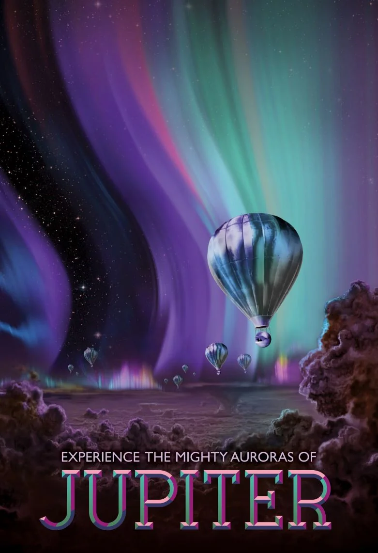
The layer stack follows the same logic as our Solar Surfing technique: start with Hazen 16pt C2S Holographic Board, apply HP White 1 wherever you need true-to-color imagery, then print CMYK on top. The white ink creates an opaque barrier that blocks the holographic pattern, giving you predictable colors. Areas without white let the rainbow shift through, creating those eye-catching iridescent reveals. Finally, UV gloss coating seals everything and protects the delicate holographic surface from scratching.
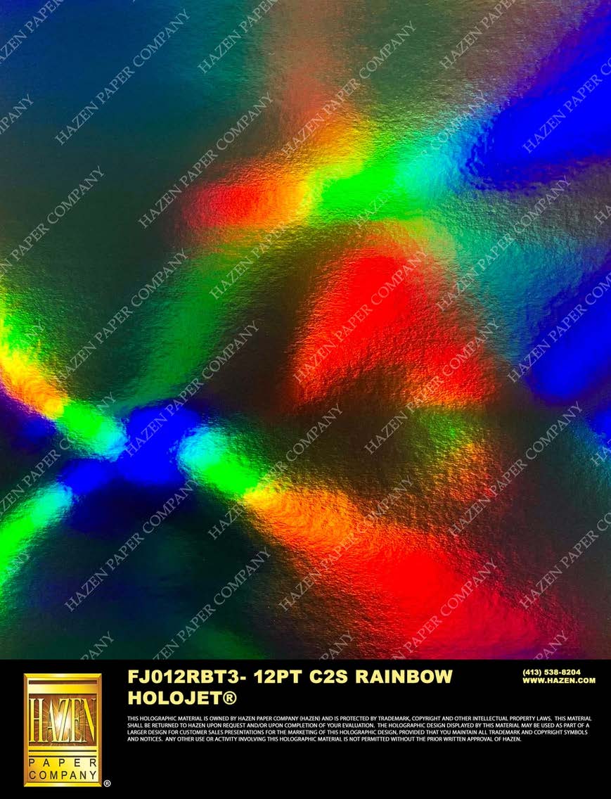
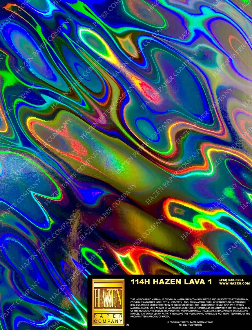
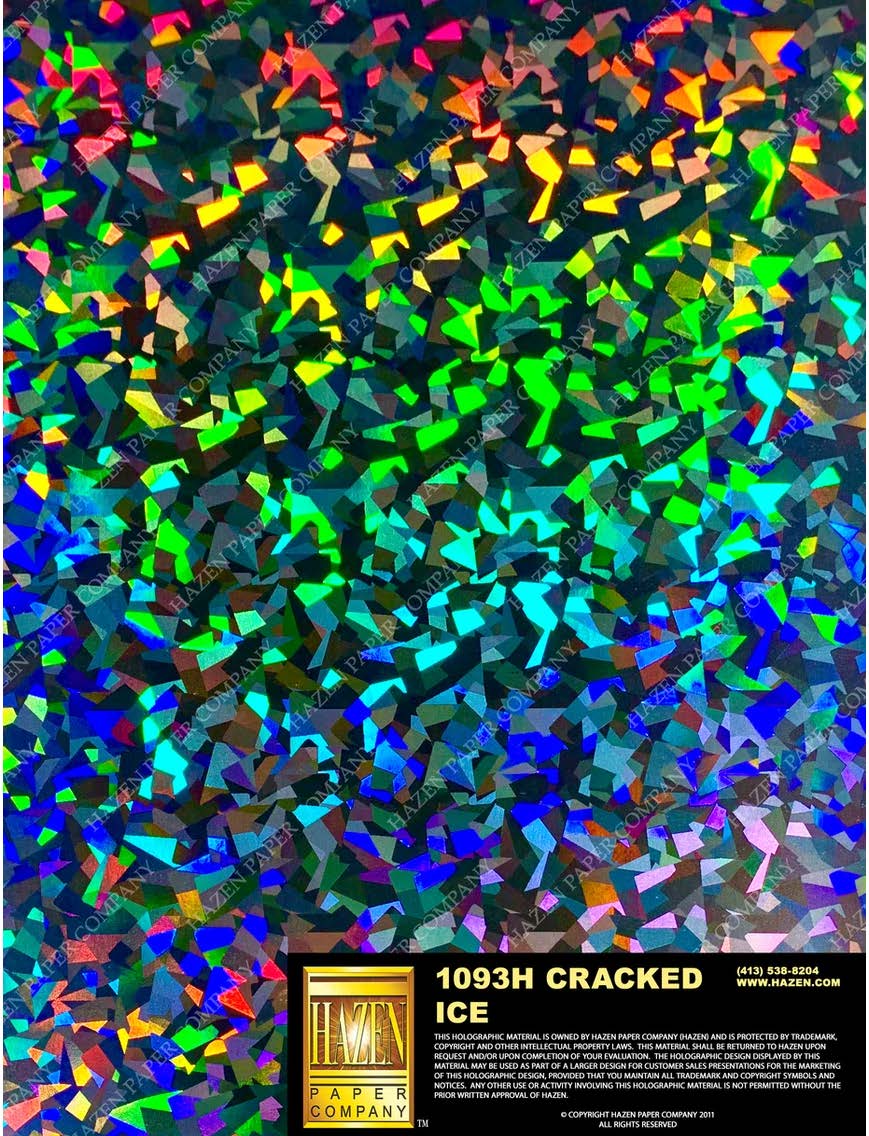
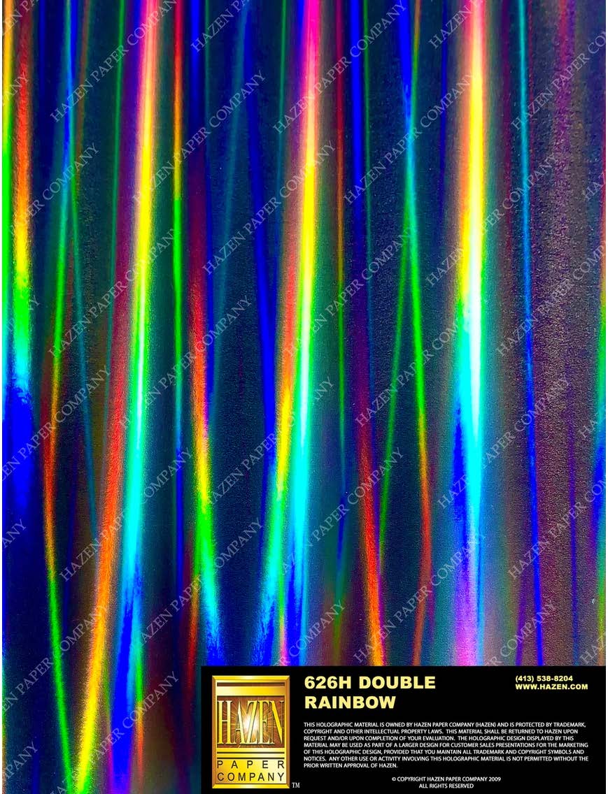
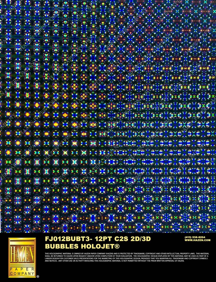
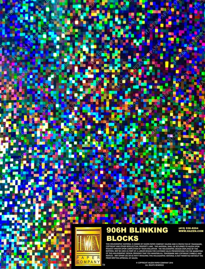
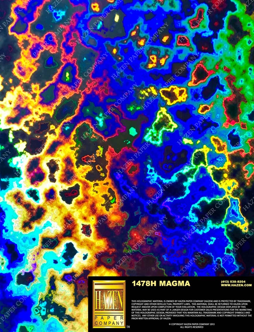
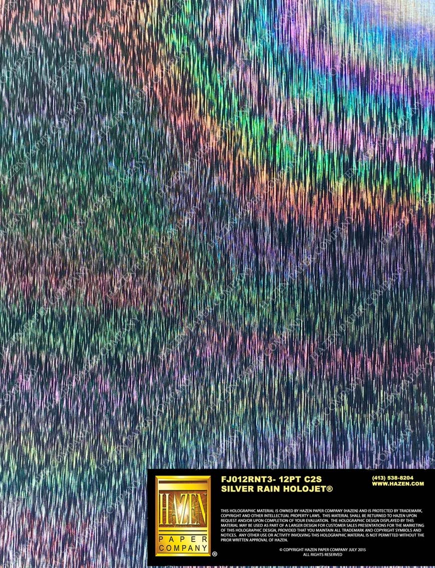
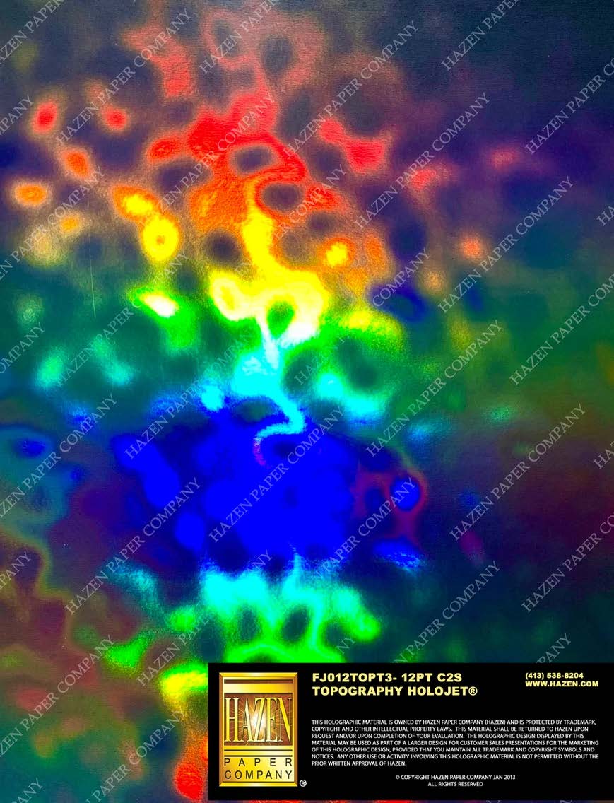
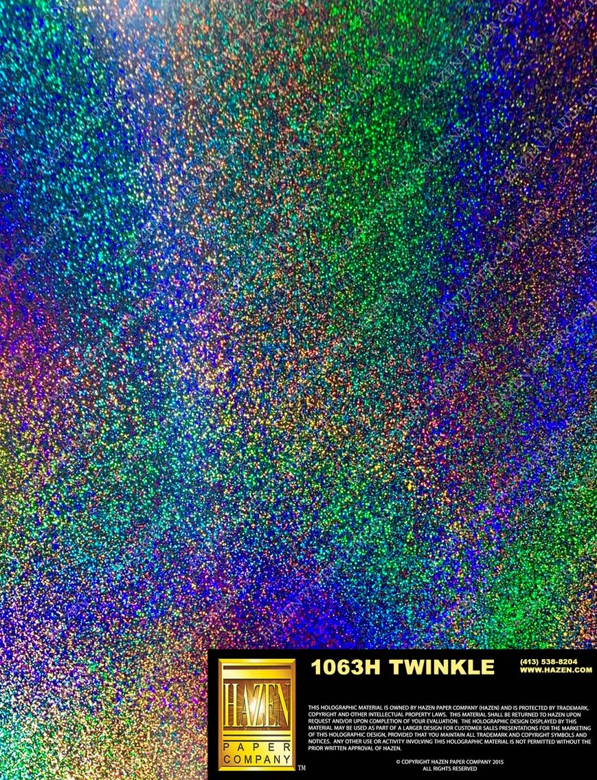
The Jupiter piece uses our "Lava" pattern, but that's just one option. Rainbow, Lava, and Cracked Ice are regularly available and ready for quick turnaround. Beyond those, hundreds of holographic patterns exist depending on your specific requirements, though they may require minimum order quantities and extended lead times. The pattern you choose should complement your design: organic imagery pairs well with flowing patterns like Lava or Rainbow, while geometric designs might call for the crystalline facets of Cracked Ice.
Pick up a finished Jupiter piece and the first thing you notice is how alive it feels. Tilt it toward the light and colors cascade across the surface in waves. The 16pt board has real weight and presence. Run your fingers across the UV-coated surface and it's smooth and protected, a far cry from the fingerprint-prone feel of uncoated holographic. That UV layer isn't optional here; we'll explain why in a moment.
Why UV Coating?
You might skip coating on other projects to save budget, but holographic board is different. The holographic surface layer is exceptionally soft and prone to scratching. We've seen pieces show handling marks within minutes of coming off the press. Without protection, every touch leaves a trace.
Three factors make UV coating essential for holographic work. First, the holographic layer is significantly more delicate than standard metalized surfaces. Silver foilboard can handle moderate handling; holographic board cannot. Second, the iridescent surface shows oils and fingerprints more prominently than any other substrate we work with. Third, anything that will be touched repeatedly needs this protection to maintain its premium appearance over time.
We've printed holographic pieces without UV coating for specific applications, like framed display pieces that will be handled once during installation and never touched again. But for anything that will be passed around, stacked, shipped, or displayed in retail environments, UV coating is non-negotiable. Budget for it from the start and you'll avoid the most common regret we hear from clients who tried to save a few cents per piece.
Best Practices
Design Considerations
- Think in negatives: Areas without white ink reveal the holographic rainbow. Plan these reveals as intentional design elements, not accidents. The most successful designs use the holographic surface as a deliberate visual feature.
- Embrace the color shift: CMYK printed on holographic looks different than on white. Colors take on iridescent undertones that shift with viewing angle. Test critical colors before committing to a full run.
-
Preview color behavior: See how your chosen colors will appear on holographic versus white-backed areas. The shift isn't a flaw; it's an opportunity to add depth and visual interest to your design.
- High contrast matters most: The holographic effect is most dramatic when paired with bold, saturated colors. Subtle pastels can get lost in the rainbow shimmer. Design for impact.
- Match pattern to content: Different holographic patterns create different moods. Lava and Rainbow work well with organic, flowing imagery. Cracked Ice suits geometric or crystalline designs. The wrong pattern can fight with your artwork.
File Setup Essentials
-
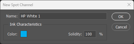
Name the spot channel exactly: The white ink spot color must be named
HP White 1(case-sensitive). The press recognizes this specific name and routes it to the white ink station. - White goes where you want true color: Select all areas in your design that need opaque, non-shifting color. These become your HP White 1 channel. Everything else shows holographic through the CMYK.
- Preview with a bold color: Set your HP White 1 spot channel to 100% cyan or magenta for visibility in your file. The color you choose has no effect on printing; it's purely for file organization.
- Don't over-mask: If your design requires 90%+ white ink coverage, consider whether metalized board or even conventional paper with spot foil might be more cost-effective. Holographic board shines when the rainbow effect is a significant design element.
Substrate & Finish
- 16pt provides stability: Holographic board is available in various weights, but 16pt C2S handles multi-pass printing without warping or registration drift. The extra caliper also adds premium feel.
- UV coating is essential: The holographic surface is soft and scratches easily. UV gloss coating is mandatory for any piece that will be handled. This is the single most important recommendation on this page.
- Pattern availability varies: Rainbow, Lava, and Cracked Ice are regularly stocked and ready for quick turnaround. Other patterns may require minimum order quantities and extended lead times. Plan accordingly.
Common Pitfalls
- Skipping UV coating: Without protection, the holographic surface shows scratches and fingerprints immediately. This is the most common regret we hear from clients. Budget for coating from day one.
- Underestimating color shift: Colors look dramatically different on rainbow-shifting substrate than on white paper. Always proof critical elements before production. The shift can be beautiful, but it should be intentional.
- Pattern mismatch: A geometric pattern like Cracked Ice can fight with organic imagery. Lava or Rainbow patterns work better with flowing compositions. Consider how pattern and artwork will interact before committing.